New Feature: Separate Opt-ins for Desktop and Mobile Devices
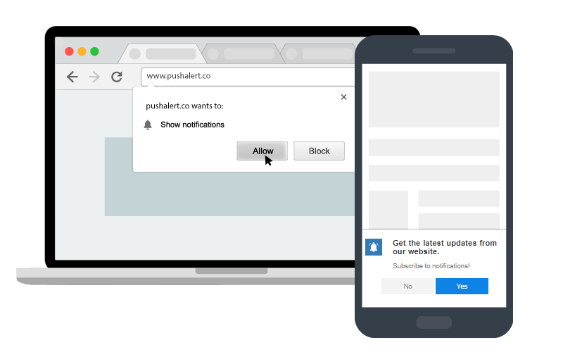
Today we are bringing separate mobile opt-in to PushAlert. Till now you could use the same opt-in, whether single-step or two-step, on both desktop and mobile devices.
Now, you can choose different opt-in strategies for desktop and mobile devices. From our research on opt-in behavior, on a desktop, people generally tend to gravitate towards the single-step opt-in. However, when browsing on mobile devices, due to the direct overlay of single-step opt-in, there are chances of it getting ignored or more unfavorably blocked by the visitor.
Therefore a two-step opt-in with more information about the benefits of subscribing to push notifications would result in better opt-in rate and fewer unsubscriptions in the long run.
Separate Mobile Opt-in for Web Push
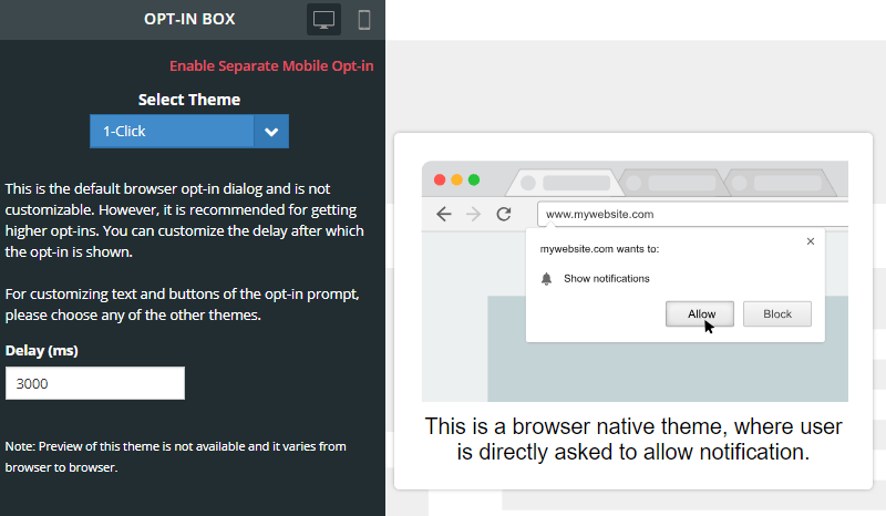
To enable separate mobile opt-in, please follow these steps:
- Head to Settings > Opt-in Box.
- At the top, click on “Enable Separate Mobile Opt-in“
- Click on “Yes” on the confirmation dialog.
- Now, select the theme you want for mobile devices. You have mobile-optimized themes available here.
- You can choose between single-step (1-click) and two-step (Native-alike, Box, Bar, and Wide-box) themes.
- Customize the text and delay as per your requirement.
- Click on “Save & Continue“
The changes should be reflected on your website within 5 minutes. If you still don’t see the new opt-in, then clear your browser cache on your mobile device.
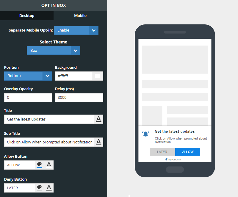
Mobile Opt-in Customization
Improving your opt-in strategy
Asking for permission to send notifications is the key to getting a good opt-in rate and in turn subscriber base. There is limited space in which you can mention the benefits and even less time to make the visitor opt-in. Therefore, the opt-in must convey immediately, the benefits of subscribing to the website’s notifications.
There are two types of opt-ins:
- Single Step Opt-in: This can only be enabled on websites running on HTTPS.
- Two Step Opt-in: Both HTTP and HTTPS sites can use two-step opt-ins. These let you customize the title, message, the image shown along with two call to action buttons that are shown on the opt-in.
Single Step Opt-in (1-click)
In the single step opt-in, the text is provided by the browser. This is not customizable at all. The text displayed depends on the language preferences of the browser. The opt-in will differ based on the browser you are using. But essentially you have three options, one to allow notifications, another to block them and one to close the opt-in prompt.
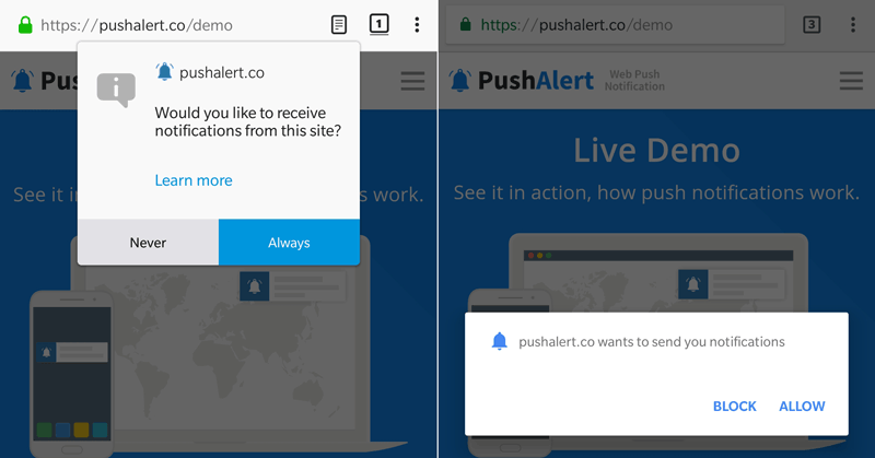
Single Step Native Opt-in Different Browsers
Although this is not customizable, it offers higher push notification opt-in rate.
Two Step Opt-in (Native-alike, Box, Bar, and Wide-box)
Two-step opt-in gives you the flexibility to explain the benefits of subscribing in your own words. There are three parts to a two-step opt-in:
- Title: The title should be kept to the point. Try something catchy which explains the direct benefit of subscribing.
- Sub-title: Give directions on how to subscribe or benefits of subscription here.
- CTA Buttons: These are the call to action buttons on the opt-in, you can customize these with your own text. For eg. on an e-commerce website, you can give a special welcome discount to web push users when they subscribe. So the CTA buttons can say: “Get Discount” and “Pay Full Price“. The customer immediately understands the benefit of subscription.
On HTTP websites, the two-step opt-in will open an intermediate page where the visitor would have to allow notifications. The intermediate page will have your logo and text that you provide while configuring the opt-in process.
Placement of Web Push Opt-in
Another point we need to cover is the placement of the opt-in. Again, you cannot customize where the single-step opt-in appears. For the two-step opt-in we have several themes which allow you to move the prompt to the top, center or bottom of the screen. Then there are different styles to the opt-in as well which you can choose from.
When to show the Web Push Opt-in
Apart from creating a compelling opt-in prompt, you have to also consider when it should be shown for maximum conversion. Before showing the opt-in, you should give a chance to the visitor to explore the website a little. Displaying the opt-in as soon as the user lands on the website may increase your opt-in rate at the start but will eventually result in a significantly higher unsubscription rate as well. Here are some cases which should help you in deciding the right time to show the opt-in.
Based on User Activity
If you run a blog or a content-based website, then the best time to show the opt-in would be when the visitor has read a part or the entire article. Similarly, for an e-commerce website, show the opt-in when the visitor has browsed for a product or checked multiple products on the website. This shows that the visitor in interested in the content, and would convert into a quality lead with push subscription.
Based on Time Spent
You can also set a specific timeout for the opt-in to appear. Once a visitor lands on the website and starts looking at your content/products, the timer runs in the background and the opt-in is fired as soon as it hits zero. Since the visitor has already spent time on the website, it is clear that they are interested and may want to be kept updated with notifications. This would transform into a sureshot subscription and also reduce unsubscriptions in the future.
Where to show the Web push Opt-in
On Content/Product Pages
If a visitor lands on a specific article on the website, he/she is interested in the content and possibly in the topic of the content as well. This gives you a chance to ask for the opt-in to get the subscription and also add the visitor to a segment. Whenever there are updates to this topic, you can send a notification to all subscribers of this segment, leading to higher CTR. Similarly, if a visitor lands on a page which provides updates on match scores of a game, you can ask for the opt-in here.
Check-out Pages
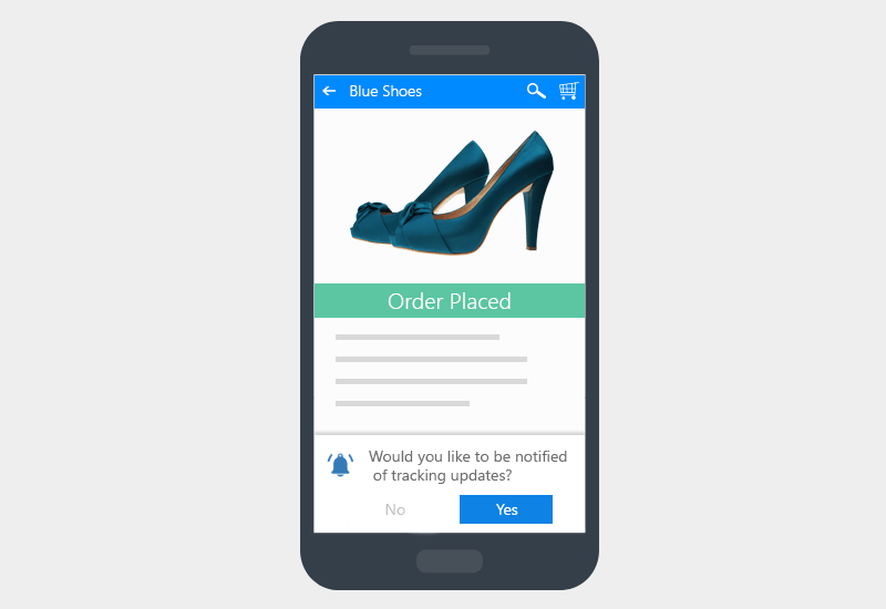
Order Tracking Updates – Web Push Opt-in Strategy
For e-commerce websites, you can ask for a subscription to push notifications after checkout to track the order. The benefit is apparent and the customer would be pleased to be kept in the loop regarding the order.
Price Drop Alert
You can also ask a visitor to opt-in on your product or comparison pages, saying that they should opt-in if they would like to be informed of price drops. This will not only boost your subscription rate but also help convert window shoppers in the long run.
Out of Stock Product Pages
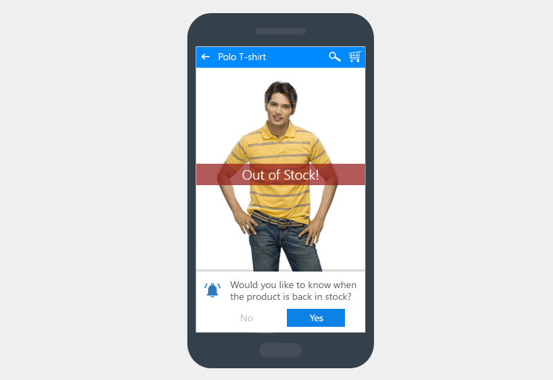
Web Push Opt-in on Out-of-Stock Product Pages
If a product is out of stock on your website, that doesn’t mean you should lose the customer who was interested in the product. Instead, you can ask for an opt-in here to be informed when the product comes back in stock. This would help placate the customer and they would wait for the product to come back in stock, rather than look for it elsewhere.
Order Status Pages
If the customer has still not subscribed to push notifications during the checkout process, you can still ask for an opt-in on the order status page. The customer is surely interested in getting details about his order, so this is the right time to ask for an opt-in to get tracking updates. Since the customer has already made the purchase, he would clearly see the benefit of getting these updates as notifications so that he doesn’t have to check the status page again.
While this is a non-exhaustive list of things you should do to improve web push opt-in, you should still hit and try these strategies to see which one works for your audience. Starting with changing the copy for the two-step opt-in to the time when it is shown. You can check your daily subscriptions in Analytics to compare with your previous opt-in strategy.
