5 Things you can do to improve web push opt-in rate
Web push notification is quickly becoming the go to marketing channel for both customer acquisition and retention. Instant delivery, powerful segmentation, and greater visibility have helped push notifications gain ground in every industry. Browser push notifications have a much higher subscription rate of 5-15% compared to just about 2% with emails.
Given that web push notifications are permission based, your opt-in strategy can have a great impact on your subscription rate.
There is little space on the subscription prompt where you can enumerate the benefits of subscribing to notifications. Therefore, the opt-in copy has to be concise and present the benefits in a one-liner.
Before we get into optimization to improve your subscription rate, there are a few things about web push opt-in prompts that we should be clear about. There are two types of opt-ins.
- Single Step Opt-in: This can only be enabled on websites running on HTTPS.
- Two Step Opt-in: Both HTTP and HTTPS sites can use two-step opt-ins. These let you customize the title, message, the image shown along with two call to action buttons that are shown on the opt-in.
1-click Opt-in
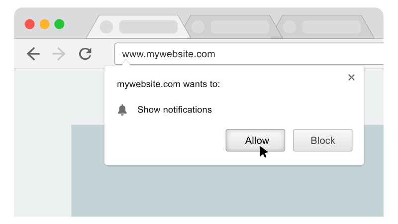
Single Step Opt-in (1-click)
Update – January 4th 2020: We do not recommend using just the native opt-in. You should use a 2-step method to ask users to subscribe. It can be a slide-in prompt using our 2-step themes, a button to ask users to subscribe or our bell widget. You can customize and use a combination of these on your websites.
In the single step opt-in, the text shown is decided by the browser. This is not customizable. But the displayed text does change based on the browser/OS localization.
One thing to note here is that the opt-in differs based on the browser you are using. Essentially though, there are 3 options, one to allow notifications, another to block them and one to close the opt-in prompt.
Although not customizable, the single-step or 1-click opt-in offers the highest push notification opt-in rate. But they also result in higher unsubscription rate, and given the changes in new Google Chrome and Mozilla firefox browser, you should avoid 1-click opt-ins.
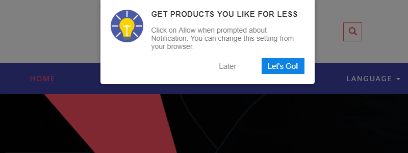
Two Step Opt-in – Customizable Subscription Prompt
Two Step Opt-in (Native-alike, Box, Bar, and Wide-box)
Two-step opt-ins give you the flexibility to describe the benefits to the visitor before they subscribe to notifications. You can customize the following in a two-step opt-in theme on PushAlert:
- Title: The title should be kept to the point. Try something catchy which explains the direct benefit of subscribing.
- Sub-title: Gives directions on how to subscribe or unsubscribe from notifications.
- Call-To-Action (CTA) Buttons: Based on the theme you choose, there can be one or two CTA buttons. You can customize the text and color of these buttons. For eg. on an e-commerce website, you can try to entice subscription with a welcome discount. In that case, the CTA buttons can say: “Get Discount” and the other can say “No, Pay Full Price“. The customer immediately understands the benefit of subscription.
On HTTP websites, the two-step opt-in opens an intermediate page where the visitor can allow the notification permission.
While on HTTPS websites, the two-step opt-in triggers the native opt-in on the same page.
Now that we have a brief about web push subscription prompts, let’s dive into improving it.
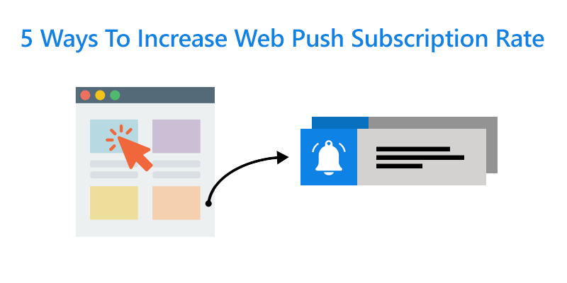
5 ways you can increase your web push subscription rate
1. Use a Two-Step Opt-in
The two-step opt-in method explains to the user the benefit of subscribing to notifications. Therefore these result in fewer unsusbcriptions and more qualified leads. Paired with a welcome notification, it creates a unified experience where the user understands what they signed up for and how the notifications would look. It removes the element of surprise.
You can create different texts based on the pages the users land on or for different language version of your website. It is always a great experience for the user when they know why they are signing up for a specific service. Especially those who are hesitant to give our their email addresses or phone numbers, web push makes it easier for marketers to reach out to them.
2. Show the opt-in after the visitor has spent some time on the website
One thing we must understand is that the customer did not come to our website to be bombarded with prompts to get their information. They came to the site as they were interested in our products or content. So give them some time to find value in what they were looking for before we ask them to subscribe to notifications.
It is not easy to figure out the optimal delay in showing the web push opt-in. By default we have set it to 3 seconds which works for most websites. But if you dive into your favorite analytics tool, you can find the average session duration. Just keep that in mind while setting up the delay.
Our recommendation would be to set it between 3 to 10 seconds. Then, based on subscriber churn analytics you can judge the subscription rate and tweak accordingly.
3. Adding the PushAlert Widget on your website
Even if the visitor has not allowed notifications permission, the widget is always there as a reminder that they are missing out on receiving product or sale alerts. The PushAlert widget can be a great tool to get those visitors to subscribe to notifications, who had earlier declined.
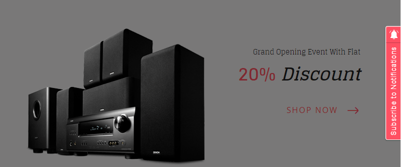
PushAlert Widget – Side Theme
It is completely customizable right down to the color scheme and text to match your website theme. Moreover, the user has complete control over their subscription, which always fosters positive sentiment.
4. Improve the Opt-in Copy, placement and colors for better subscription rate
Although the single-step opt-in offers higher subscription rate, it is devoid of any context. At times, it becomes necessary to use the two-step opt-in themes.
Creating a killer Opt-in Copy
The first and most important thing is creating the perfect title and sub-title for the opt-in. It should explain the benefits of subscription at first sight. Be it to get order updates, product offers, stock alerts, the more concise these are, the better.
One of our users decided to move their order status alerts completely on web push and their customers couldn’t be happier. The proposition was simple – “Declutter your inbox, opt for notifications.” This boosted the subscription rate by 5X and customer satisfaction through the roof.
Opt-in Placement
With each of the opt-in themes you get several placement options, be it the center of the screen where it is most visible to the bottom of the screen where it is less intrusive.
On e-commerce websites, most actionable content is right in the eye-line of the visitor, therefore the placement in the top left and center work best. While for content websites, people tend to read through a page and then scroll, so a placement at the top or bottom would be most beneficial.
Product/Content Pages
If a customer lands on a specific page on your site, they are certainly interested in that product or content. This gives you a change to get a subscriber and also segment the visitor.
Whenever there are any updates relating to the topic or product category, you can send a notification to this segment, getting you higher CTR and also prevent unsubscriptions.
Checkout Pages
On e-commerce sites you can ask the visitor to opt-in after they have made a purchase so that they can get order updates. The benefit is clear and the customer would be happy to receive such updates.
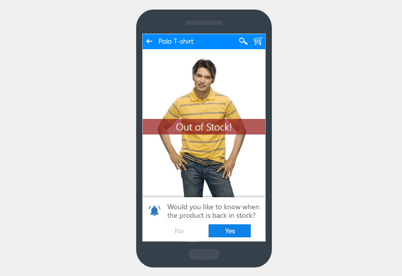
Web Push Opt-in on Out-of Stock Product Pages
Out-of-stock Products
If a product is out of stock, it doesn’t have to mean losing a sale. You can prompt the visitor to subscribe to notifications for stock alerts. This way you may have just saved a sale and prevented the customer from looking for the product elsewhere.
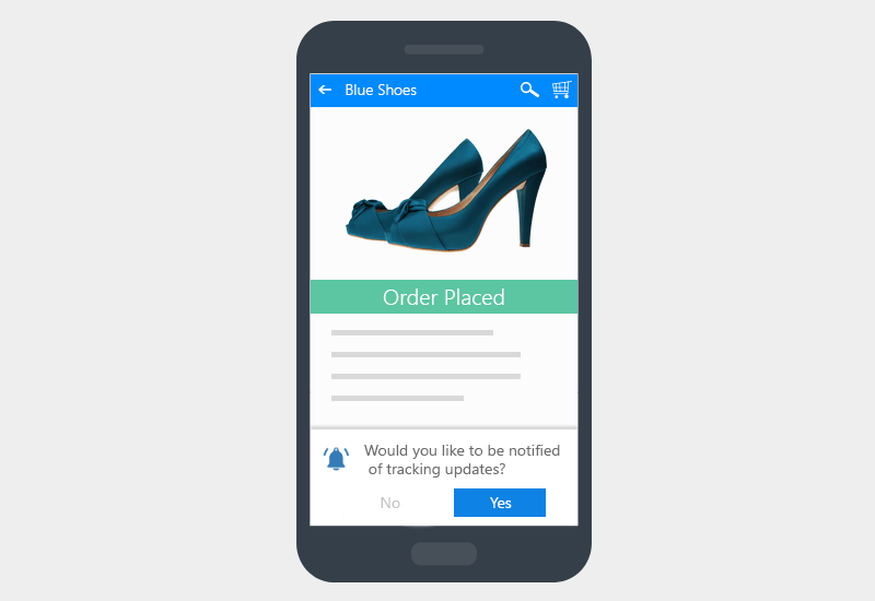
Order Tracking Updates – Web Push Opt-in Strategy
Order Status Page
If the customer has still not subscribed, you can ask for subscription on the order status page of their accounts. The customer definitely wants to know when the order would be delivered, you can ask them to subscribe to notifications to get the tracking details as soon as they as available.
Colors
While choosing the colors for your call to action on the two-step opt-ins you should consider the general theme of your site and branding.
Web push subscription by default does not require any personal data, but, your customers may not know that. Therefore a theme matching your site, with your own logo fosters trust in that they are subscribing to the authentic source and their privacy is intact.
5. Add custom subscription buttons
Apart from the subscription prompt (opt-in) which is shown automatically after a set delay, you can also add custom subscription buttons on your site.
Even if the visitor missed the previous opt-in, a strategically located button can help boost subscription rate. This can be in your site footer, at the end of the an article or right on the order confirmation/updates page.
This subtle way of asking for a subscription is less intrusive and still gets the job done. The same principles as a two-step opt-in apply here as well. There should be a core benefit proposition presented in a concise manner.
Although this is a short list of ways to improve subscription rate, it is equally important to retain subscribers. Sending notifications too frequently, or sending irrelevant notifications without segmentation to your entire subscriber base will always result in mass unsubscriptions.
For the most effective notification – timing, content and segmentation hold the key. With PushAlert you have all this information available right on you dashboard and you can always reach out to us to optimize your conversion rate and reduce churn.
