Effects and Positions - The entry and exit animations of popups along with the position where they should appear.
Apart from the content, appearance, trigger for popups, you can also customize how they appear and where. The effects and positions option lets you define the location of the popups on your page along with their animation.
Effects
There are four animations to choose from including fade, slide, and zoom. More animations are on the way. Here's a bit more detail about each of the effects. All you need to do is just head into the Effects and Positions settings, and click on the Effects tab to choose the desired animation.
- Fade-in - The classic lightbox animation, where the popup slowly comes into view.
- Slide-in - This animation commands a bit more attention. The popup here slides in to view from the nearest window border.
- Zoom-in - Here, the popup grows into view right in the front of the customer.
- Zoom-out - This animation is the exact opposite of zooming in, here an extra-large popup shrinks to fit the window size. Both the zoom animations focus user's attention immediately.
- None - Using this option you can disable the entry and exit animation of the popup completely.
Positions
You can show the popup on any part of your webpage in a 9-slice model. You can further fine tune the position with the offset parameters which takes in data in pixels. The entire page is divided into 3 main sections, each of which is further divided into 3 sections to give you the maximum flexibility.
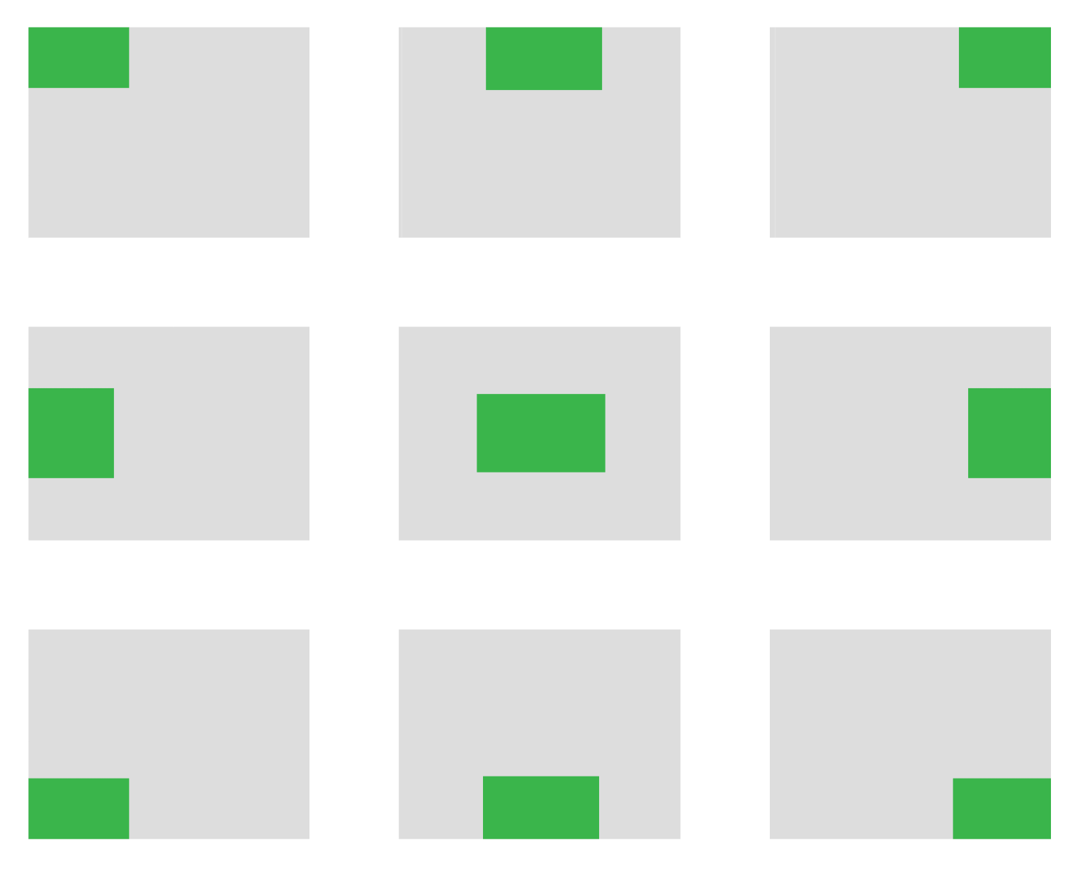
- Top Left, Top and Top Right
- Left, Center and Right
- Bottom Left, Bottom and Bottom Right